Background:
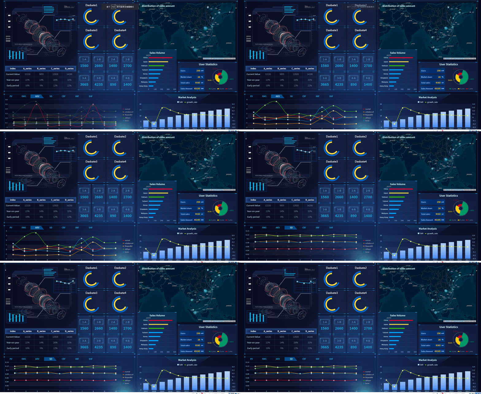
Users of various departments and levels in the huge organisation are required to view data and analytics from their perspectives. The analytics were mission critical, and they are required to support management decisions.
Solution:
After in-depth requirement analysis and stakeholders interview, a unified dashboard with UX tailored for respective user departments is proposed, integrating numerous operation systems. A monitoring system and process automation with A.I. engine is also in place, which eliminate human errors, drastically reduce human effort, and ensure seamless operations. The unified dashboard also needed to support client's sophisticated data and user access requirements, as well as the huge data volume involved.
Achievements:
User personalises dashboard simply via drag-and-drop on the browser based application; the delightful, self-explanatory UX design speeds up adoption and on-going maintenance. The project is a full system implementation that covered sophisticated integration with client's A.I. engine, the numerous data sources and analytics results, and the massive volume of transactions.
Aviation
Data Visualisation, Business Consulting, System Implementation
Personalised Data Visualisation, Process Automation, Mobile-friendly Analytics
